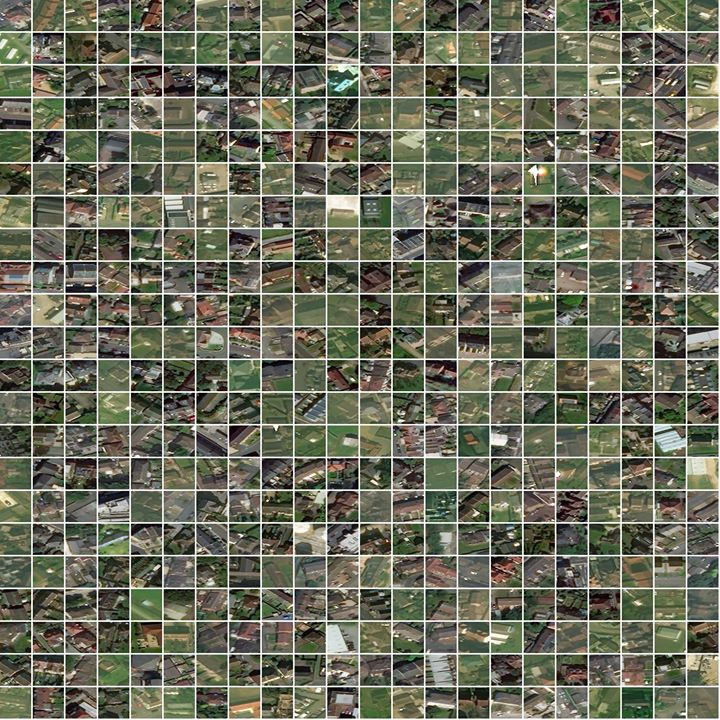
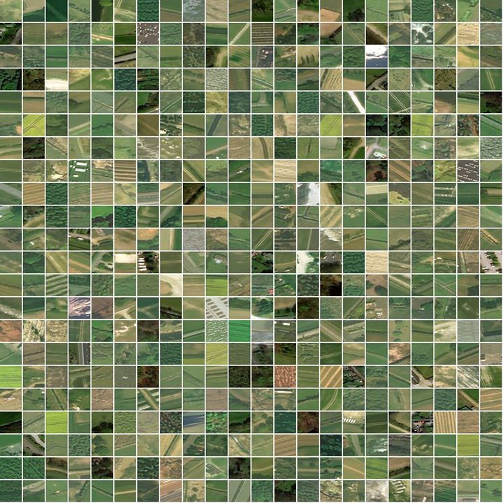
Facebook was able to achieve this by combing through about 11.5 billion 64 x 64 pixels satellite images of the region to identify buildings. This would normally take a lot of time to do, however, employing artificial intelligence makes the process autonomous and expedient. Using this approach, it was able to identify buildings in the satellite images and compare them with census data to ascertain where the population is resident. High-resolution imagery already exists for the most part of the world and that provides a solid background for this type of project. On your own, it is possible to pick out spots where localities are situated but that in itself will be a very rigorous task to undertake even on a small scale and will take a huge amount of time. Doing so on a continental stage which is as large as Africa would be even impossible to do manually but with the help of AI, things are very much easier. An ordinary population data would only give you the number of people living in a certain place with the uninhabited areas included. The new Facebook population density map solves that problem by giving you exactly where people are on the map with some precision to it. In fact, Facebook’s AI team was able to confirm that 996 out of 1000 individual satellite images that were labeled to have a building actually did. To guarantee the authenticity of the map, teams were periodically sent out to verify the accuracy of the map during the project. Also, the Columbia University’s Center for International Earth Science Information Network (CIESIN) at Columbia University and other partners like World Bank was able to confirm the work done. For Africa which has 1.2 billion people spread across about 16 million square miles, Facebook’s AI was able to identify 110 million buildings from satellite images in few days. In its quest to provide population density maps such as this for the world, Facebook will be dealing with approximately 1.5 billion petabytes of data in the form of high-resolution satellite image. It plans to cover the world in terms of providing population density maps in the coming years. However, the map is aimed to help humanitarian efforts in reaching more people. Organisations like Red cross, Bill and Melinda Gate’s foundation, World Bank, and OpenStreetMap have all been able to benefit from the solution. The map updates every 3 months and you can get it from here. The map is accessible to everyone plus you don’t have to pay a dime to get it.


